Layout, Hierarchy & Responsive UI
A self-directed visual design exercise exploring a fictional travel platform across desktop and mobile. Focused on destination discovery, typographic hierarchy, and responsive layout craft.
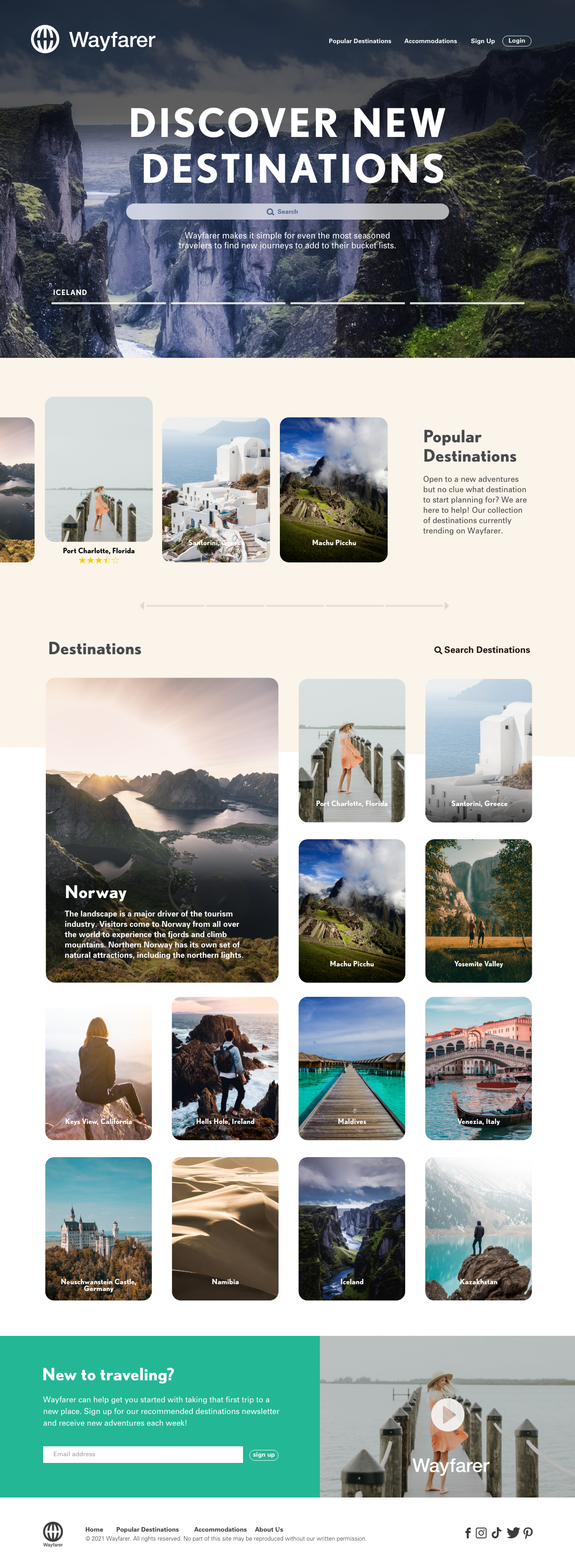
Primary screen output from the sprint. Grid-based layout establishing content hierarchy across the key flow.
The brief
Grid logic and visual hierarchy across desktop and mobile—no existing design system, no brand guidelines. Every layout decision is justified by structure, not aesthetics.
Grid & type
decisions
I established a 12-column grid with consistent gutter spacing before touching any components. Typographic hierarchy was set first—three levels maximum—to constrain decision-making during execution.
Three screens covering the primary user flow: entry, interaction, and result. Each screen uses the same grid and type scale—consistency within the sprint constraint.
 Entry point.
 Core interaction.
 Result view.
What I'd do with more time
The color palette was functional but never tested against WCAG contrast ratios. Empty and error states weren't designed. Given more time: accessibility audit across all text and background combinations, edge case screens for empty, error, and loading states, and grid stress-testing at 375px viewport width.
View Next Project