Con Edison:
Digital
Transformation
Con Edison's clean energy programs were buried in legacy navigation, with users dropping off within seconds. As Lead UI Designer, I led design strategy and art direction in partnership with the agency on the CARE program launch. Search, filtering, and illustration systems shipped to millions of New York customers and contractors.
Context
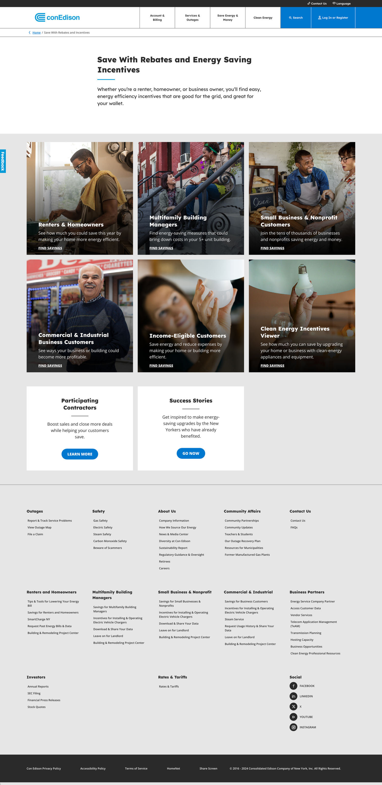
Con Edison customers and contractors looking for clean energy incentives: heat pumps, electric systems, split heating, rebates for renters and homeowners were dropping off the site before reaching the right section. The previous experience was a set of image tile cards linking to buried program pages. There was no filtering, no clear hierarchy, and no obvious entry point. Users who didn't already know what they were looking for gave up before they found it.
The problem
Structural discoverability
Key program pages were buried three submenus deep. The filter for finding clean energy programs was a static data table with no sorting and no way to narrow results. There was no clear path from landing to finding a relevant incentive.
Program awareness
Most users didn't know the CARE program existed at all. Even users who would have benefited from the incentives had no reason to look for something they didn't know was available.
My role
I came into this project with no prior knowledge of ConEd's site structure, programs, or user base, which turned out to be an asset as much as a challenge. Learning the platform from scratch meant I was asking the same questions a confused user would ask. That instinct helped me identify where the experience was failing.
I owned the work from initial audit through to production launch: brand compliance research, competitive analysis, wireframe development, design system application, custom icon and illustration work in Adobe Illustrator, developer handoff, QA feedback sessions, and bug documentation.
When I started flagging issues that crossed the line between UI and UX, specifically hierarchy decisions in the IA that weren't landing at the subpage level and readability problems that affected user behavior logic, I had to conduct independent competitive research, document the evidence, and build the case for those revisions with internal stakeholders and the agency. Navigating that grey area taught me more about enterprise design collaboration than anything else in this engagement.
Three workstreams;
one platform initiative
01
Search & Discovery
Faceted filter refined for accessibility, brand compliance, and usability. Users narrow by customer type, savings category, and energy type.
View →02
Workflow Efficiency
A net-new module: contractor and partner data moved from a raw Excel table into a filterable, accessible interface with borough-level filtering.
View →03
Visual Language
Graphic enhancement modules, custom icons, and branded illustration system extending ConEd's brand library and surfacing buried CTAs.
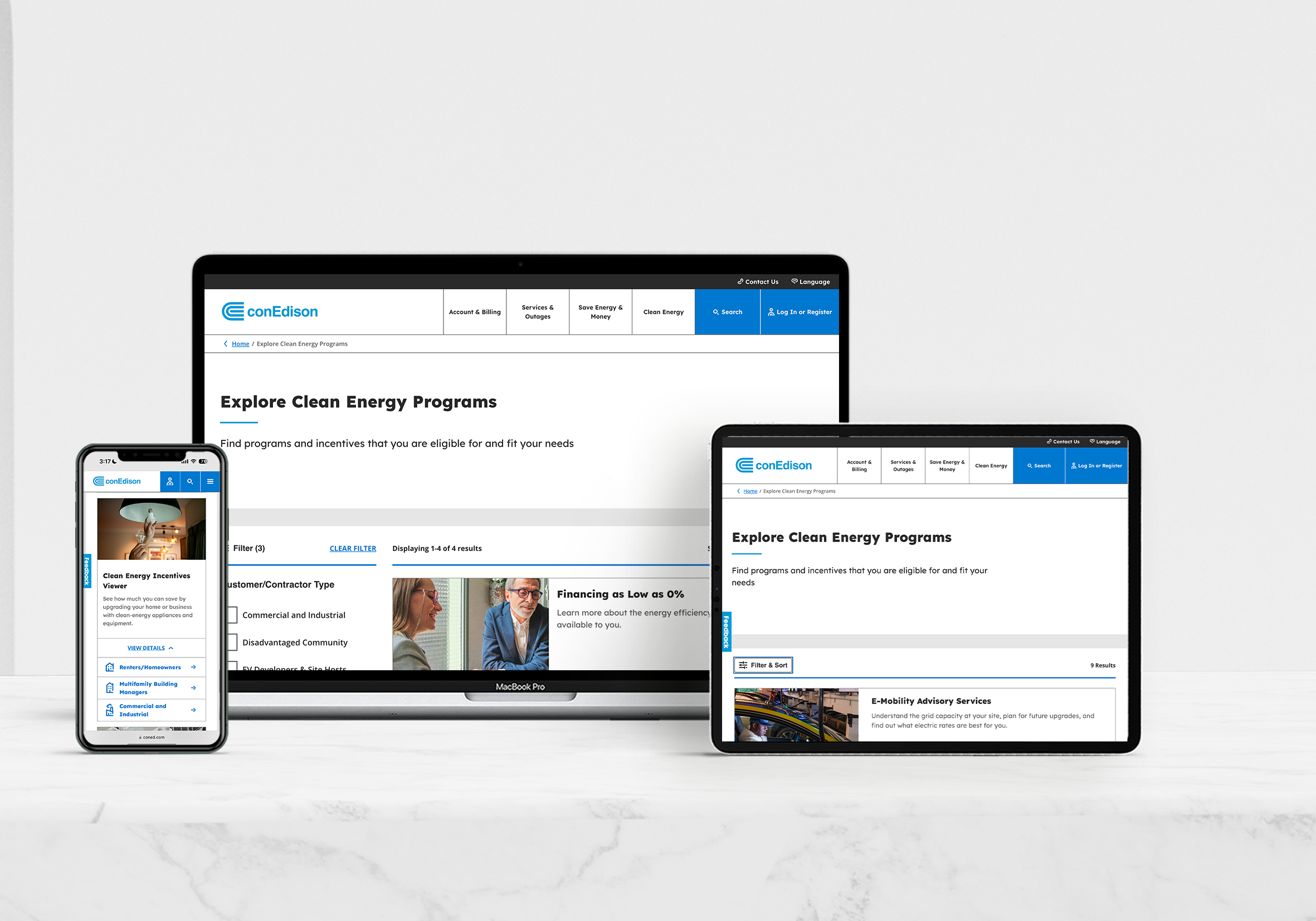
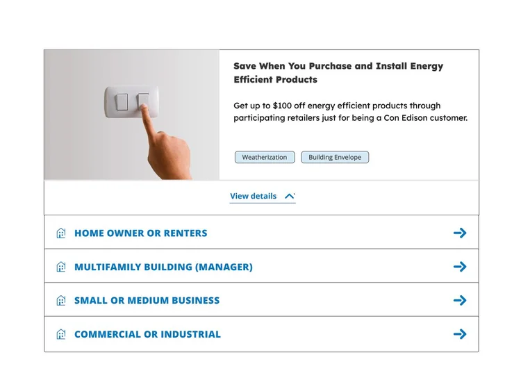
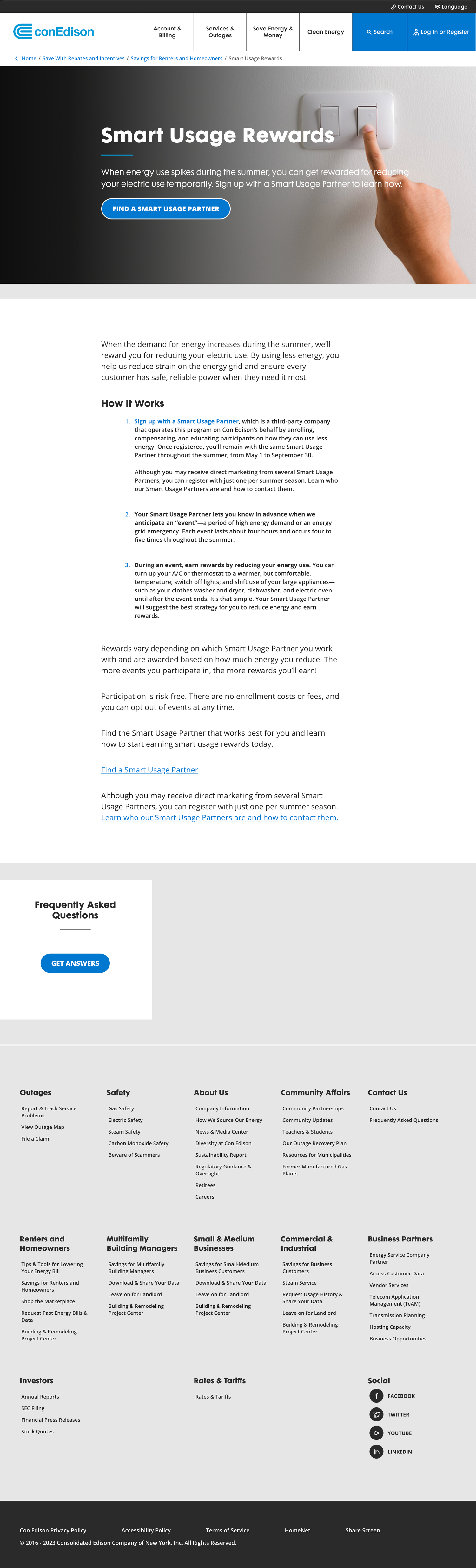
View →Faceted Filter: Find Your Clean Energy Program
Key program pages were buried three submenus deep. The legacy filter was a static data table: no sorting, no narrowing, just rows of information with no way to act on them. Users who didn't know exactly what they were looking for left without finding it.
The Friction: Static data tables required manual parsing, leading to high cognitive load and user drop-off.
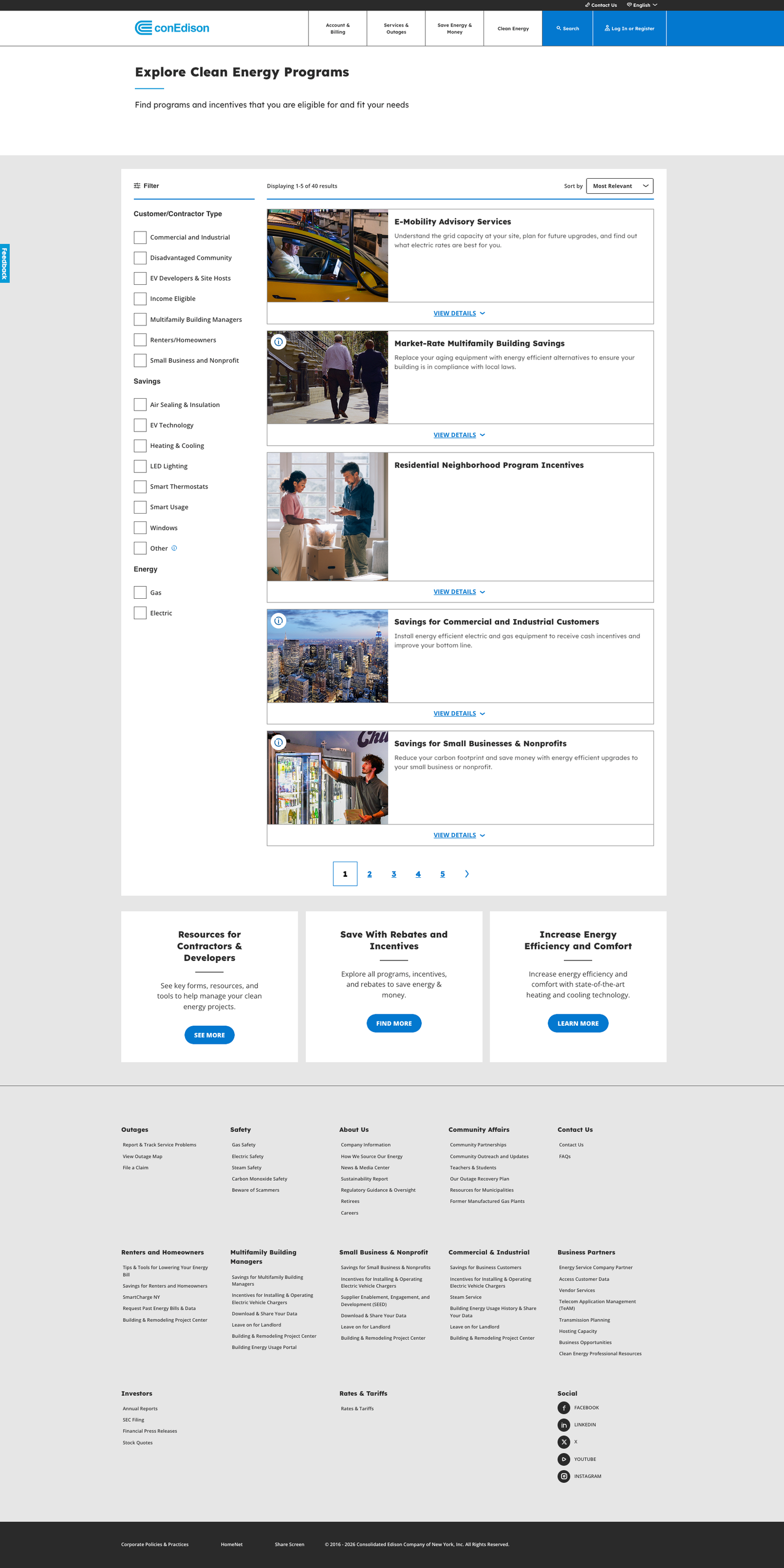
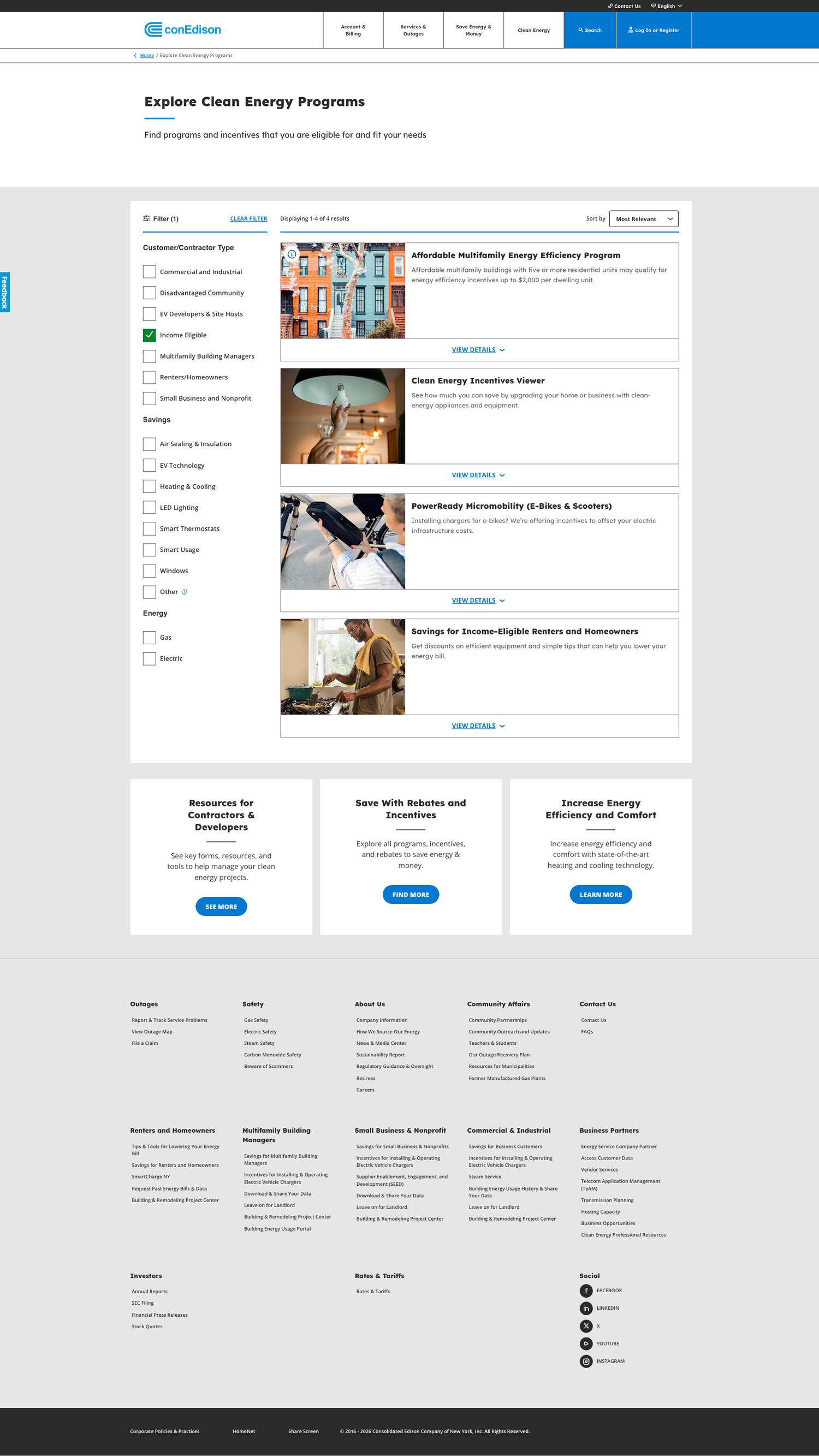
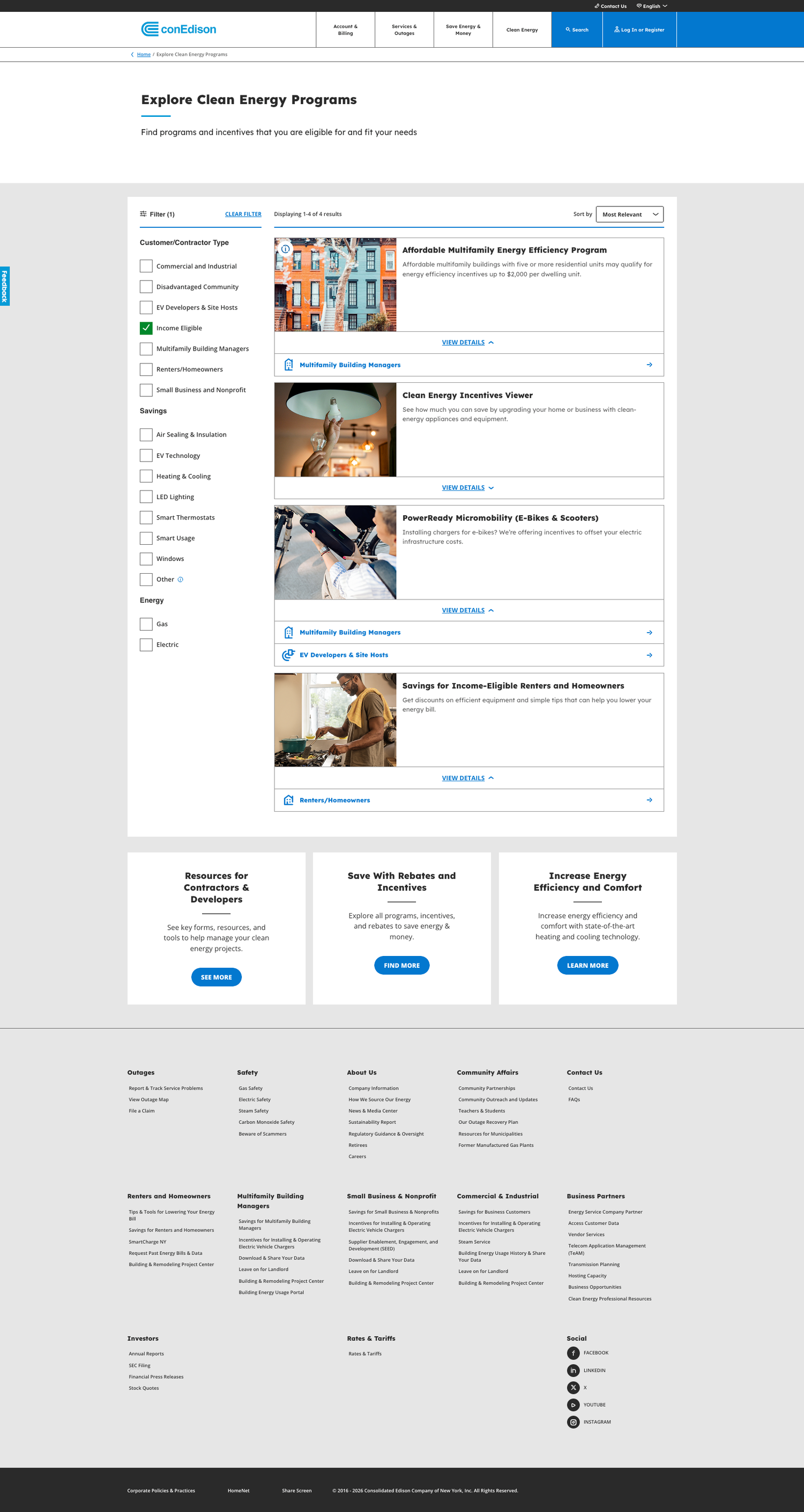
The Solution: Interactive faceted filtering narrows results in real-time, improving findability for clean energy programs.
Process context
The project followed a compressed, non-linear process common in enterprise engagements.
Mid-fidelity comps were delivered for content copy review: UI design, accessibility compliance, and brand refinement were addressed in a dedicated phase that followed. I led the brand compliance audit, rebuilt the grid, addressed accessibility gaps, and worked in partnership with the agency to bring deliverables up to ConEd's corporate digital standards. Navigating that gap between what was scoped and what was needed taught me how to advocate for quality within business constraints.
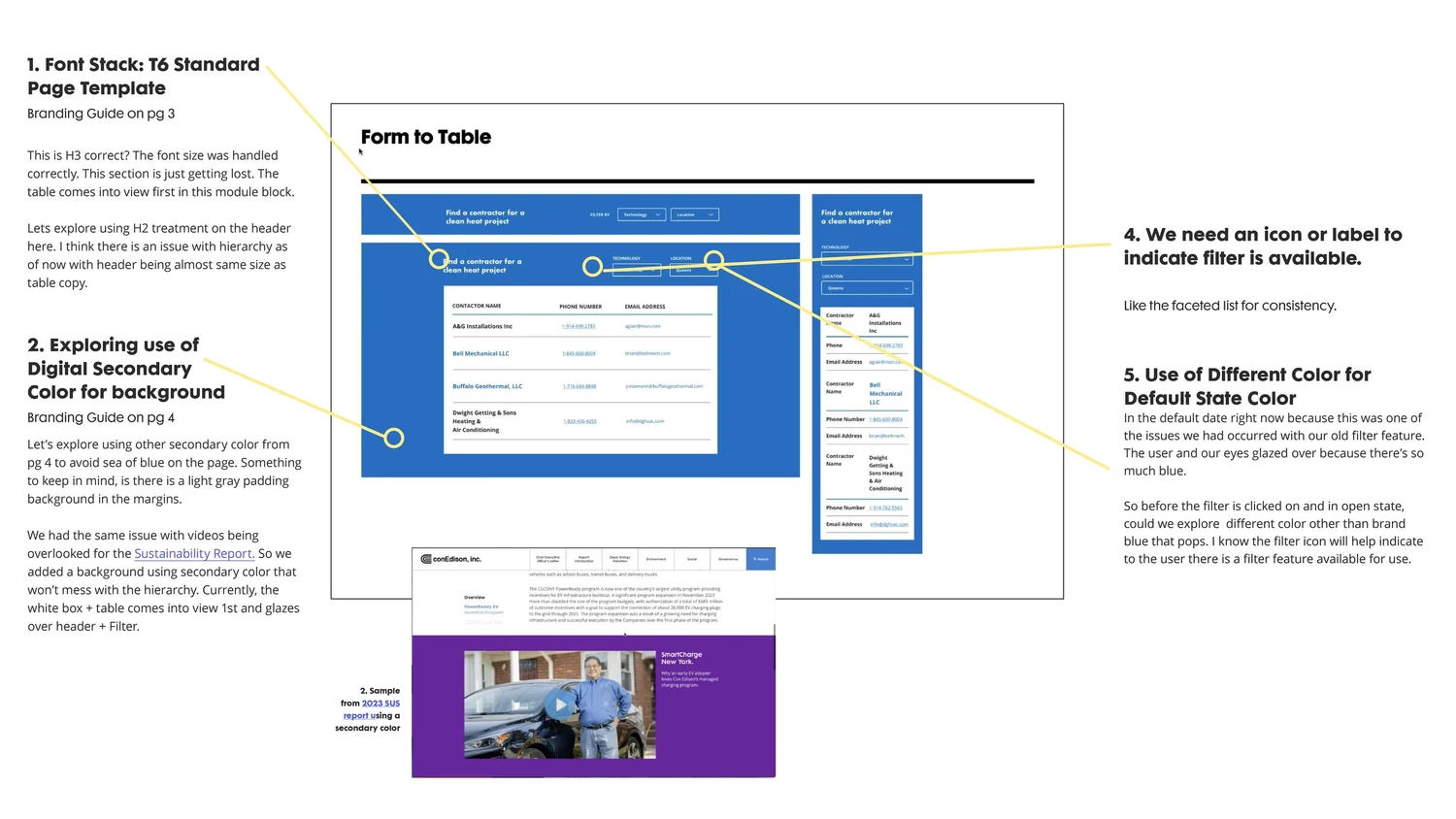
Wireframe Evolution
Agency BaselineInitial handoff scoped for copy review only. Grid systems and brand compliance were not yet addressed.
Iterative RefinementGrid rebuilt from the ground up, applying brand compliance and establishing a clear information hierarchy.
Final FoundationServes as the foundation for UI implementation, optimized for user wayfinding and scalability.
Program awareness strategy
Moving "Find Your Clean Energy Program" into global navigation was a program awareness decision as much as a UX one.
The programs existed: heat pumps, electric systems, split heating, incentives for renters and contractors. Most users simply didn't know. Surfacing the program at the navigation level meant every site visitor could discover it without already knowing to look for it.
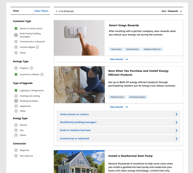
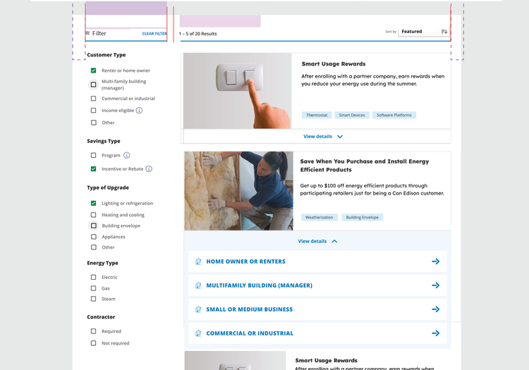
Filter system: brand compliance & accessibility
The agency delivered a faceted filter that was directionally correct but had significant issues.
Accessibility gaps in the open state, brand-noncompliant color usage, incorrect icon application, and usability problems at the interaction level. I audited the filter against ConEd's corporate digital guidelines and WCAG standards, developed a revised open and closed state with proper visual differentiation, added icons to the open state for accessibility, and worked in partnership with the agency to bring the component into compliance. I also introduced a new light purple tint to address visual fatigue caused by the default brand blue.
Grid & brand compliance
The same compliance issues appeared throughout the agency's deliverables: button treatment, link styles, typographic hierarchy, and color application.
I conducted a full brand audit against ConEd's corporate digital guidelines and used competitive analysis to document and justify each required revision. This created the evidence base for stakeholder alignment on the scope of changes needed.
Final shipped UI
View live project →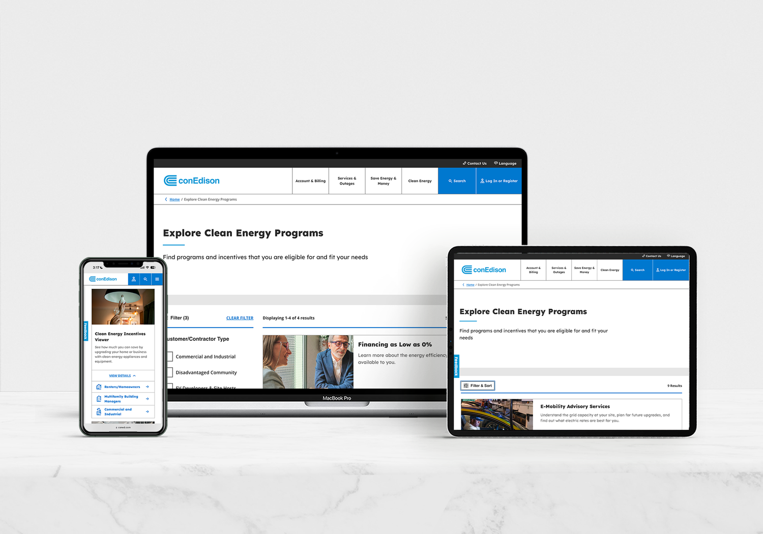
Pillar 02 / Workflow Efficiency
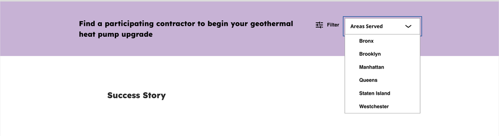
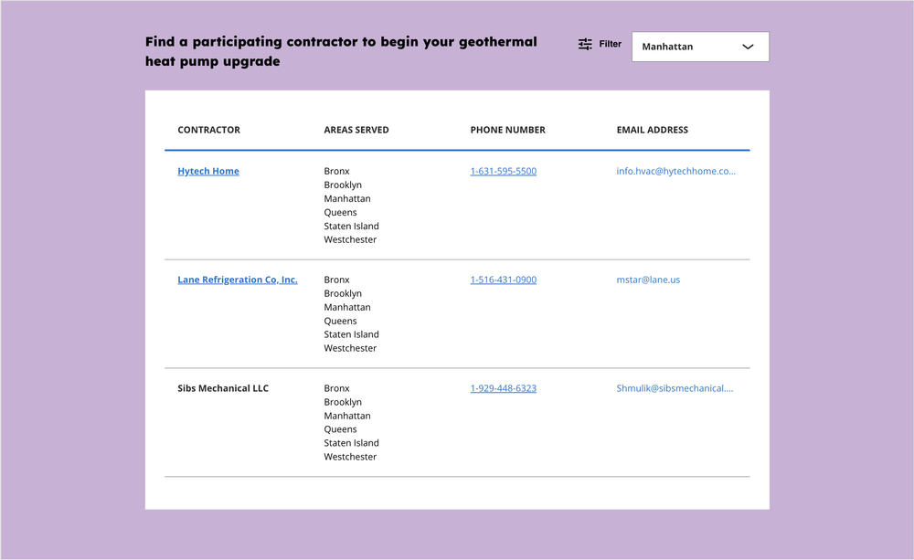
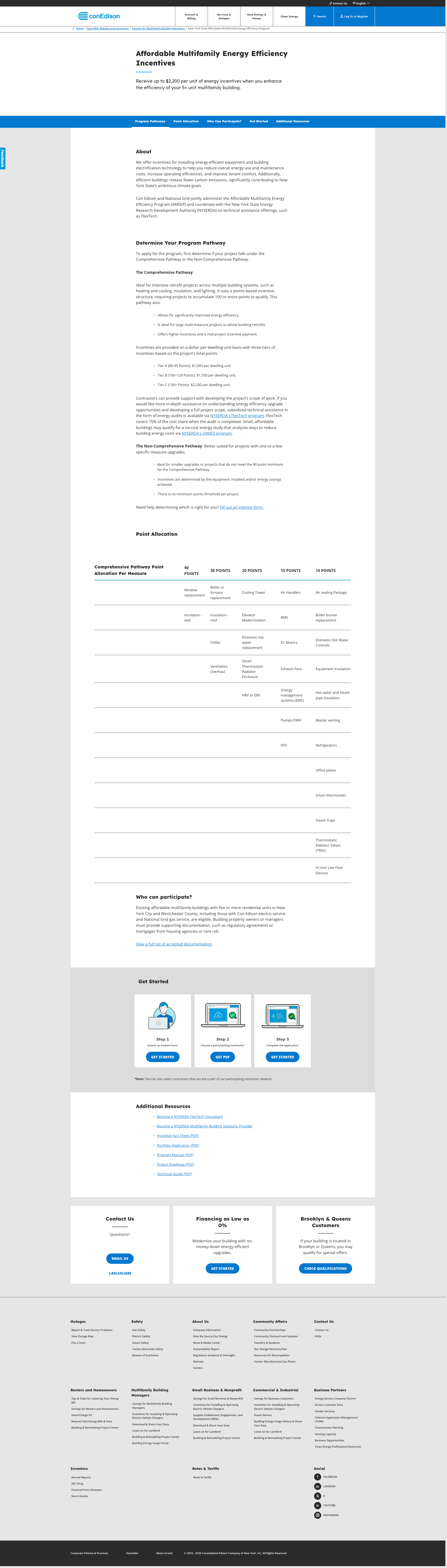
Table to Filter: Contractor Partner Redesign
Before this engagement, contractor and partner data for clean energy programs existed only as a raw Excel-format table on a subpage. Users had to scroll the entire list to find what they needed, making it nearly unusable for contractors seeking approved partners and for consumers seeking contractors to implement their selected programs.
The redesign decision
This was a net-new module—nothing equivalent existed in the platform.
Working in partnership with the agency, I developed a Table-to-Filter format that replaced the raw data table with a filterable, accessible interface. The core logic: let users define their criteria first, then surface only the relevant results. A second variation adds borough-level filtering, allowing New York users to narrow by location and avoid endless scrolling through citywide contractor lists. Each interaction state—default, open, and filtered—was scoped separately, with particular attention to visually differentiating closed and open states to ensure the filter affordance was immediately legible to users.
Color and accessibility
The original default state used ConEd brand blue throughout, which caused visual fatigue.
Users were glazing over the filter controls because there was insufficient contrast between interactive and non-interactive elements. I developed a new light purple tint and introduced it into the color palette specifically to address this, creating a clear visual signal for the open and active state that didn't compete with the brand blue used elsewhere on the page.
First Agency Iteration: Feedback round identifying grid and brand inconsistencies in the initial module structure.

Pillar 03 / Visual Language
Graphic Modules, Icons & Illustration System
Dense body copy was causing CTA blindness. The content users needed most—how to get started, what they qualified for, what to do next—was buried in unstructured paragraphs with no visual hierarchy.
Quick Wins phase
"How to Get Started" module—built during Quick Wins phase as a static image due to CMS template constraints. Content buried in body copy was extracted and surfaced as a scannable illustrated visual.
From numbered list
to illustrated module
During the Quick Wins phase I extracted the steps and built a static illustrated module to call out the workflow visually. That module became the foundation for the agency's full UI redesign.
The Friction: Instructions buried in body copy meant users missed the primary steps.
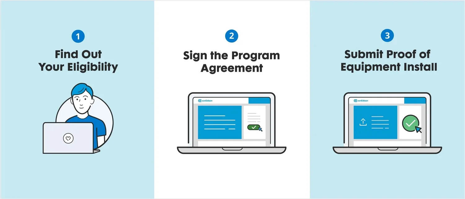
Quick Wins Phase: Shipping illustrated modules provided an immediate UX lift.
The Resolution: The finalized "Get Started" module live on coned.com.
Systematizing the Visual Language
To ensure long-term scalability across ConEd's digital ecosystem, I transitioned from localized modules to a unified asset library. This system governs optical weight, color usage (WCAG 2.1 compliant), and grid alignment, allowing for seamless integration into enterprise product environments serving millions of users.
Assets are constructed with a dual-stroke hierarchy to differentiate foreground emphasis from secondary detail.
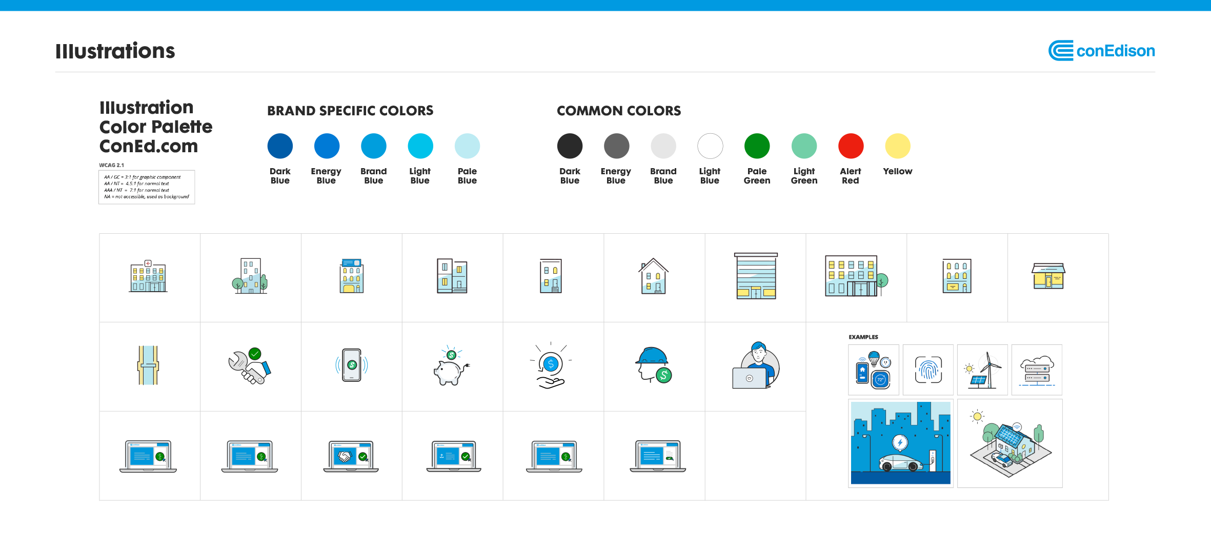 Central Library: Component Architecture & Palette
 Scaled Implementation: E-Mobility, Micromobility & Smart Charge Library
BEYOND CARE
ESG Report Redesign
The CARE platform wasn't the only ConEd product the design system extended to. I designed the homepage layout for ConEd's 2023 Sustainability Report, partnering with the agency to convert an essay-format report into a structured digital landing page. The illustration system from CARE extended into the ESG report's visual language.
View live report →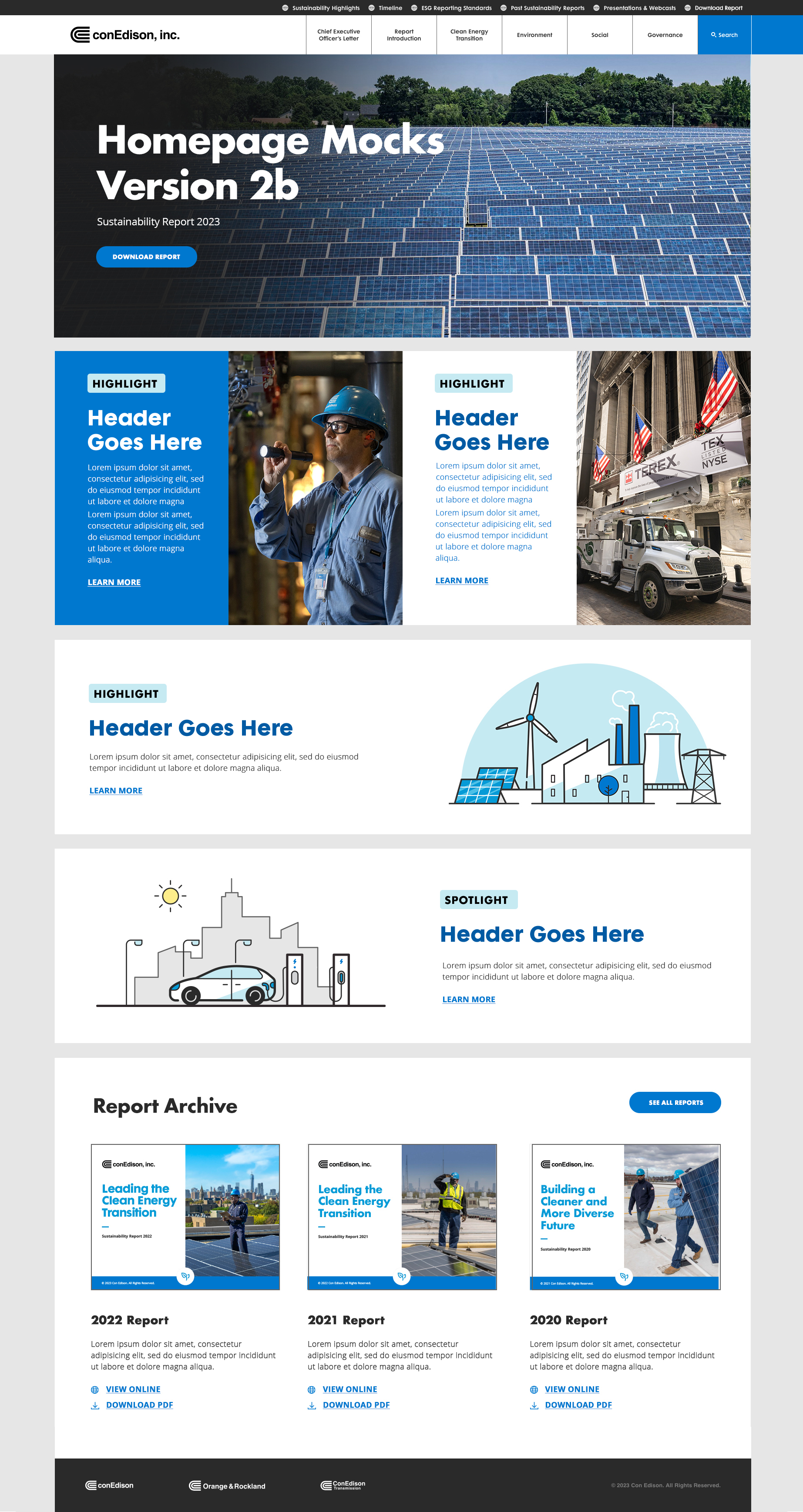
Design mock — homepage layout, image direction, type system
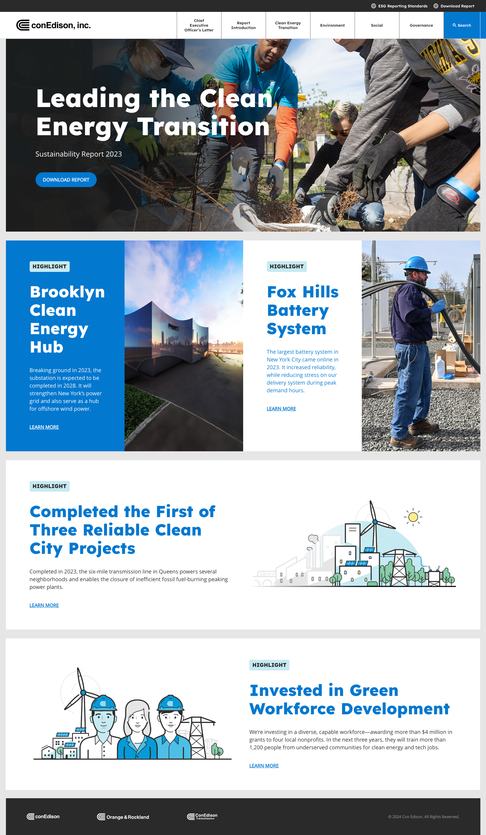
Shipped — live on lite.conedison.com
Results
What shipped and what it meant
Every workstream addressed a specific failure point in the platform. Together, they moved the CARE program from effectively invisible to accessible.
Shipped to production
10+ modules live on coned.com across CARE and the Sustainability Report—used by millions of NY customers and contractors.
Program awareness created
Clean energy programs moved from a buried submenu into global navigation. Findable without already knowing to look for them.
Filtering replaced scrolling
A static data table became a faceted filter across two workstreams. Users act on information rather than reading through it all.
Brand library extended
Custom icons and illustrations added to ConEd's brand library—system scaled beyond CARE to E-Mobility and Sustainability.
Outcome
Following launch, the team reported significant improvement in drop-off rates and user frustration signals. Specific metrics weren't accessible to the design team, a common constraint in enterprise engagements, but the directional signal from stakeholders was consistently positive.
What I'd do differently
I'd push for low-fidelity wireframes before mid-fi. The absence of that step cost weeks and created ambiguity for everyone downstream. I'd also build design system documentation in parallel with the design work rather than after it. ConEd's brand guidelines needed a cleaner translation layer than the one that existed. And I'd run at least one round of usability testing on the faceted filter before handoff, specifically on mobile multi-select behavior.
View next project.