Ampersand
Brand identity and digital design system for Ampersand, a data-driven TV advertising technology company owned by Comcast, Charter, and Cox. The platform unifies linear and streaming TV inventory for cross-screen advertising.
Context
In 2022, Ampersand had a new brand identity but no consistent application of it. I joined as one of two designers on a small marketing and publicity team. The work: applying the brand across every external touchpoint—LinkedIn, email, paid ads, and platform UI.
My role
Art direction, animation, brand application, email design, LinkedIn redesign, and icon system. First time Ampersand ran LinkedIn targeted paid ads—I designed and animated all of them. Also handled art direction, brand application, email design, LinkedIn profile redesign, and the icon system.
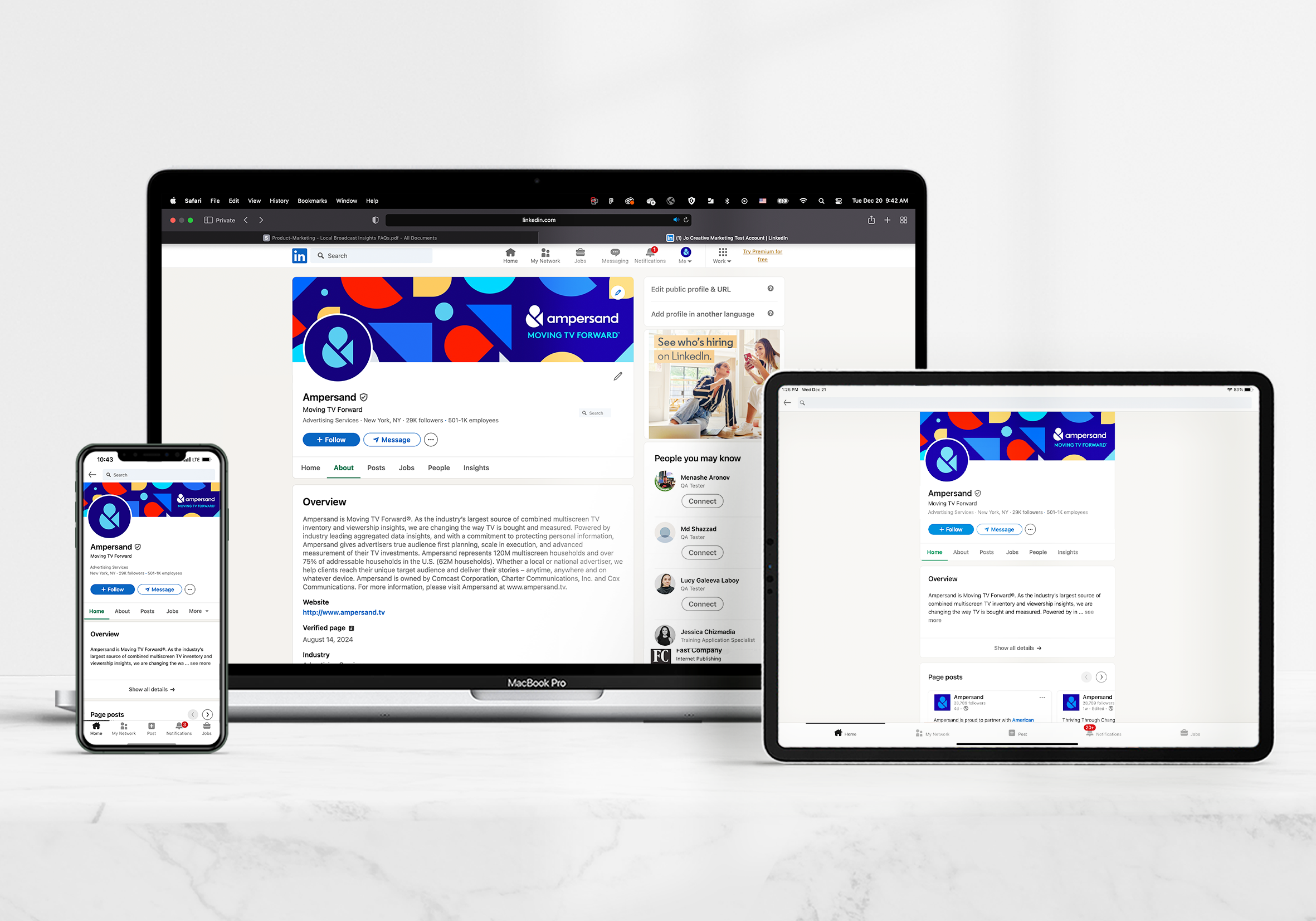
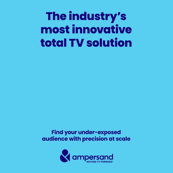
LinkedIn redesign
The existing LinkedIn presence lacked visual consistency and brand clarity. I redesigned the profile and content templates to establish a coherent visual identity across the platform.
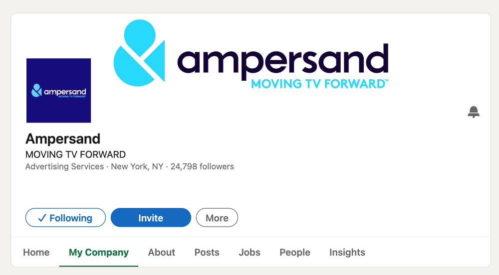
Legacy state
Redesign

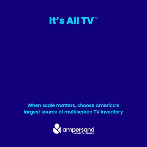
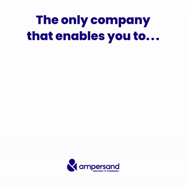
Animated ads
Three animated ad executions for social media. Same motion system across all three: consistent easing, timing, and brand color application.
Newsletter redesign
Optimizing visual hierarchy for enterprise communications. This walkthrough demonstrates the updated interaction model within the Outlook environment.
Icon system
In 2022, Ampersand had a new brand identity but no consistent application of it. I joined as one of two designers on a small marketing and publicity team. The work: applying the brand across every external touchpoint—LinkedIn, email, paid ads, and platform UI.
This was also my first UI engagement, designed entirely in Illustrator before Figma was part of my workflow.


Note: Interface has been intentionally cropped and zoomed for icon legibility.
What this
taught me
This engagement is where brand systems thinking began to converge with product thinking. Designing a consistent icon system that works at small sizes on screen is the same problem as designing components that work across breakpoints—the constraints differ, but the discipline is the same. The newsletter redesign specifically pushed me to think about reading hierarchy as a UX problem, not just a layout problem. That framing carried directly into the ConEd CARE work.
View Next Project