Con Edison
I have omitted and obfuscated confidential information in this case study to comply with my non-disclosure agreement.
Founded by Thomas Edison in 1823, Consolidated Edison (Con Edison) is the second-largest regulated energy-related products and services company in the U.S., following PG&E. Con Edison is a primary utility provider in New York City, Westchester County, and parts of New Jersey, with services impacting millions of users.

Overview of Projects
CARE - Complete Website Redesign (Lead UI Design + Art Direction)
Faceted Filter - Find Your Clean Energy (Customer, Analytics, and Reporting Engagement [CARE] Team)
Table to Filter- Find Your Clean Energy (Customer, Analytics, and Reporting Engagement [CARE] Team)
Graphic Enhancement Module- Find Your Clean Energy (Customer, Analytics, and Reporting Engagement [CARE] Team)
Overview
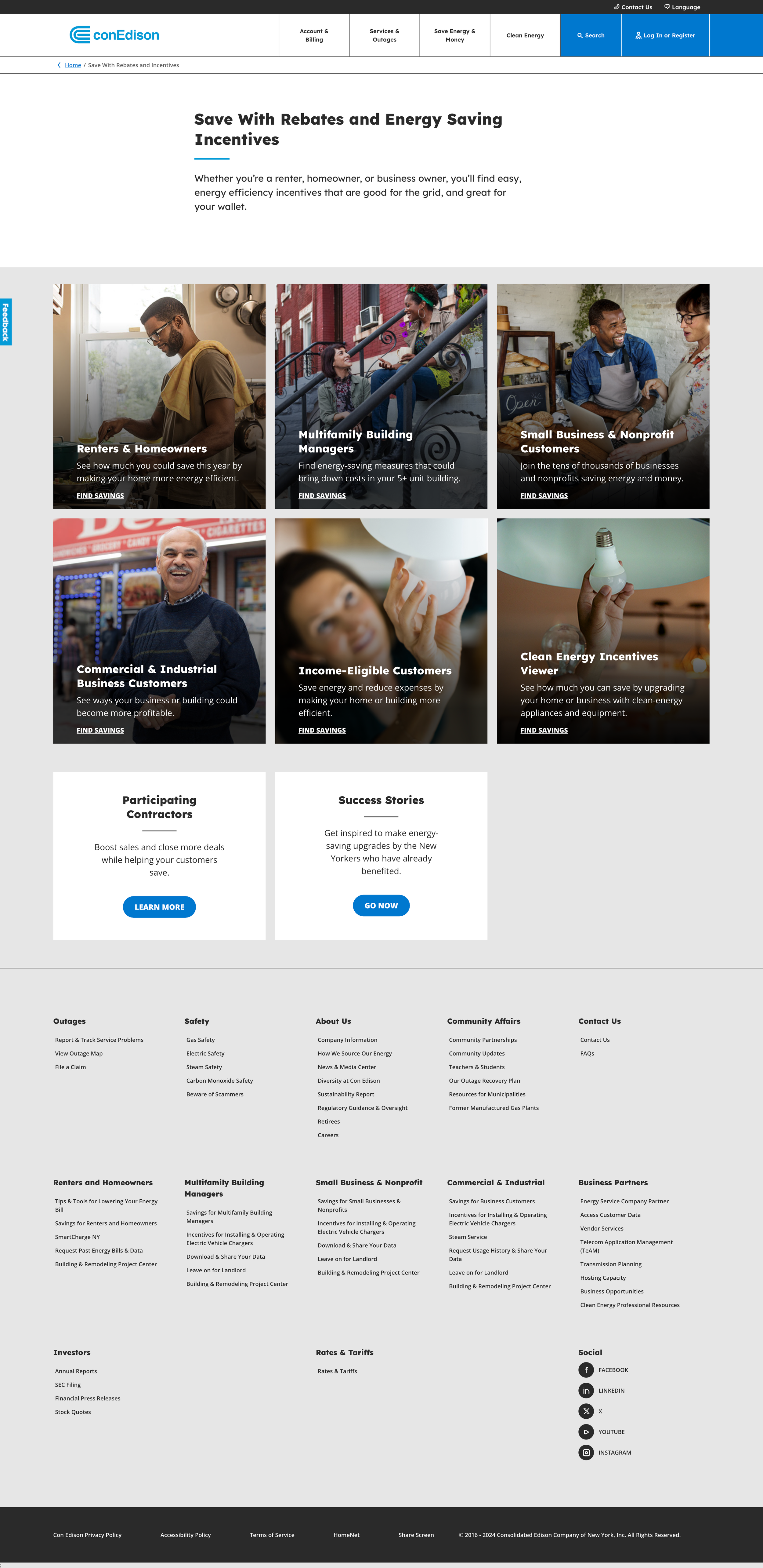
I led the design and user experience transformation of Con Edison's customer-facing digital platforms. The scope included a complete website redesign of the Sustainability Report and CARE sections to address key usability challenges contributing to high bounce rates and low user engagement.
Problem
High Bounce Rates: The previous site structure resulted in frustration and abandonment due to content overload, poor hierarchy, complex processes, and excessive clicks.
Inefficient Navigation: Critical features were buried in the submenus, making it difficult for users to access essential tools and information.
Low Feature Awareness & Discoverability: Key features such as personalized energy-saving tips and rebates were poorly visible, leading to underuse.
Research + User Insights
Through extensive user research—including interviews, surveys, analytics reviews, and competitive analysis of other utility companies and top tech companies—we uncovered several key insights:
Reduce Friction: Users needed fewer clicks to access content, reduced clutter, and quicker access to information on clean energy incentives and rebates.
Cumbersome Filters: The existing tables and forms for filtering partner options were overly complex, making it hard for users to find relevant information.
Hidden Key Features: Key features (e.g., Clean Energy Rebates & Incentives) are buried and hard to discover, causing missed engagement opportunities.
Design Strategy & High-level Goals
The primary objective was simplifying the user experience, improving task flow, and increasing feature visibility. By focusing on faceted filtering, graphic enhancement modules, custom icons, branded illustrations, and responsive wireframing, I collaborated with a cross-functional team to deliver a seamless, user-centered solution aligned with ConEd’s business goals and brand standards.
PROJECT ONE:
Find your Clean Energy Program
Faceted Filter + Table to Filter + Graphic Enhancement module:
CARE [Customer Analytics Reporting and Engagement Team]
Design Strategy + Proposed Solution:
Crafting a User-Centered Experience:
Simplify Navigation: Reduce the number of clicks required to access the Find Your Clean Energy Program section.
Enhance Filtering: Implement a faceted filtering system to help users easily narrow results by Customer Type, Savings, and Energy Type.
Reduce Scrolling and Streamline Filtering: Redesign the Contractor Partner table to a Table-to-Filter format, improving usability and efficiency.
Increase Feature Discoverability: Enhance the visibility of the Find Your Clean Energy Program section using visual cues, hierarchy, and contextual relevance to boost engagement.
Maintain Brand Consistency: Ensure all design systems and grids align with Con Edison’s established brand guidelines for visual coherence.
Table to Form Transition: Transition the lengthy contractor list for incentives and rebates into a more user-friendly Table-to-Form layout, reducing cognitive load and making the information more digestible.
Design Process
Wireframing & Layout Design: The design process began with mid-fidelity wireframes provided by the external agency’s UX and content teams. After reviewing these, I refined the grid structure, typography, and layout to better align with Con Edison’s brand standards and address the identified usability challenges. The final design was built upon my refined wireframes, which served as the foundation for the UI team’s work.
Mid-Fidelity Wireframe for Content Modeling, created by the Agency’s UX Designer.

Table to Form in Early UI Design Stages: First work in progress feedback for UI and how we landed on the final design below.
Table to Form in Early UI Design Stages: First work in progress feedback for UI and how we landed on the final design below.
First iteration: Mid-fidelity wireframe I designed, with feedback to better align the UI with our grid and brand systems.

Final iteration: Mid-fidelity wireframe I designed, incorporating feedback that became the foundation for the current design.
Design Decisions
Content Hierarchy & Clarity: Users were overwhelmed by dense content, leading to fatigue and high abandonment. I worked with the UX and Content/Copy Team to streamline the copy and refine the visual hierarchy, making the content more readable and easier to navigate, resulting in improved engagement.
Typography & Grid Refinement: I refined the typography and grid system to enhance legibility, visual balance, and consistency across pages. This ensured a unified design language aligned with Con Ed’s brand guidelines for a more seamless user experience.
Faceted Filtering: Implemented a filtering system on the “Find Your Clean Energy Program” pages, allowing users to quickly narrow results by categories (e.g., Customer Type, Savings, and Energy Type), improving the search process and user experience.
Simplified Navigation: Moved the “Find Your Clean Energy Program” page from a buried submenu into the global navigation, increasing visibility and ease of access for users seeking rebates and incentives.
New Streamlined Experience
Explore the live platform to see the full implementation of the redesigned user experience, including the enhanced filtering system and updated navigation.
Table to Form Final Result
To see the module’s full implementation, visit the live site.

1. Table to Form: Default State

2. Table to Form: Filter Dropdown Open State (Note: The carrot icon is not flipping 180° for the open state; the development team has noted this bug and is in the backlog.)

3. Table to Form: Open State
Faceted Filtering
This allows users to filter through Clean Energy programs and the most relevant incentives to them, streamlining the experience. Visit the Live Site.
New Streamlined Experience
vs Legacy
Graphic Enhancement Modules + Branded Illustrations
One of the main challenges we faced was losing the call to action (CTA). Users struggle with dense content and lack clear next steps, leading to fatigue and high bounce rates. A key redesign aspect was breaking down dense content and using graphic enhancement modules that paired illustrations with text, solving our hierarchy issues and making the content more digestible. This approach made the site feel fresher and gave users intuitive and more actionable insights.
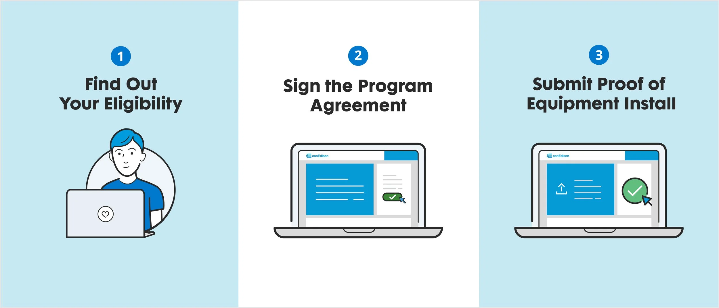
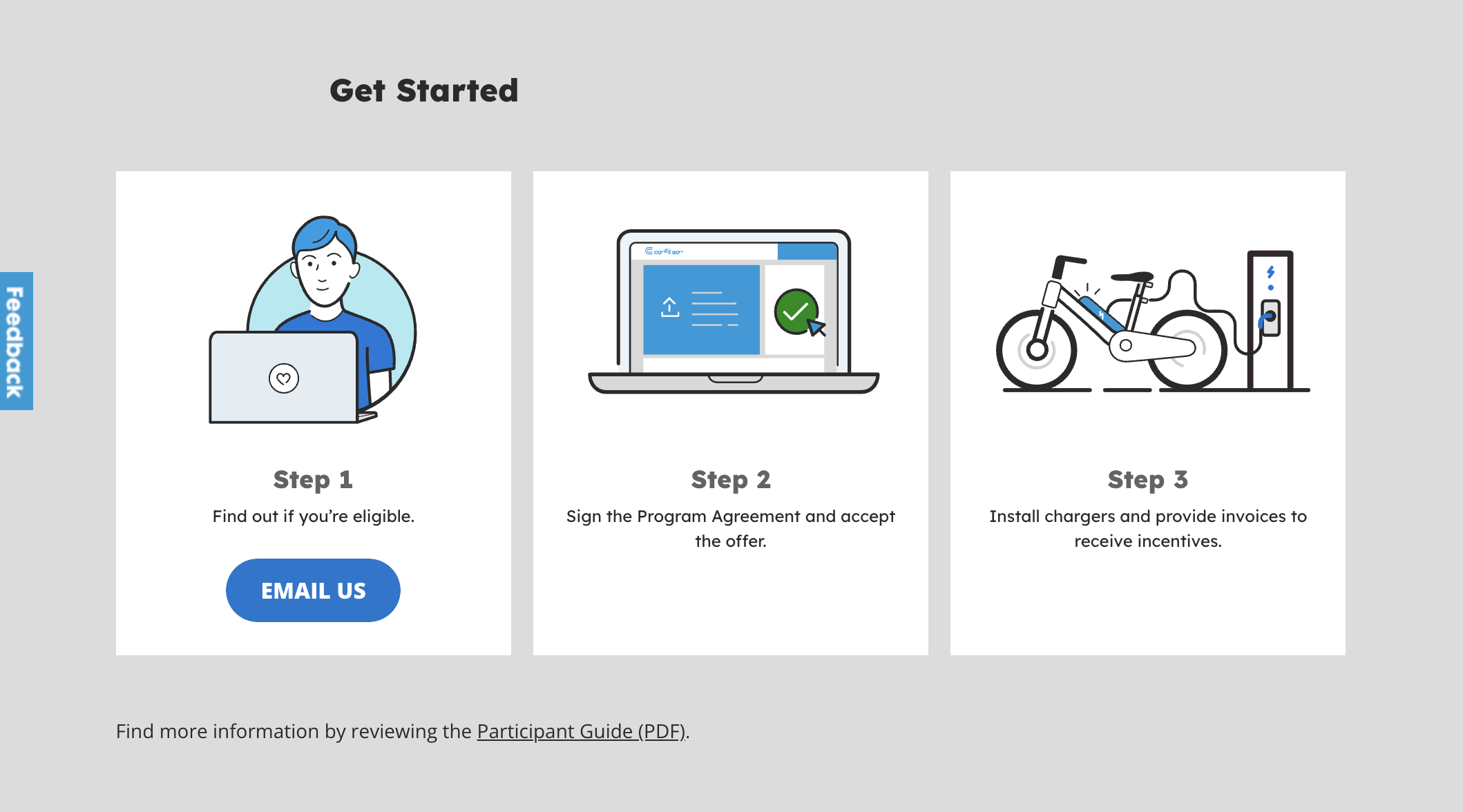
During the Quick-Wins phase, I created the first iteration of the “How to Get Started” graphic module. Due to template limitations for desktop and mobile, this module was designed as a static image without CTA buttons. Content that was buried in the body copy was now front and center in this new graphic format.
The first design laid the foundation for the agency’s design team, who would take the concept further. I partnered with the team to art-direct and refine the final version of the module, ensuring the design was consistent with the wireframes and aligned with the overall design system.
Explore the live platform to see the full implementation of the redesigned user experience. Visit the Live Site.
As we moved into the UI design stage, I collaborated with the agency’s UI designer to select the appropriate icons and illustrations. Rather than starting from scratch, we used the assets from the first iteration and integrated them with the existing design system. However, if the current library didn’t have suitable assets for specific content, I designed custom assets to convey the particular content better.

Custom Illustrations integrated into the existing brand system and illustration library.
Results
The result was a cohesive set of graphic assets seamlessly integrated into the website and aligned with ConEd’s brand identity. These visual elements guided users to their goals—whether finding the right energy-saving program or understanding how rebates worked. The result was a more intuitive and enjoyable user experience with clear visual cues and actionable insights that improved user engagement.
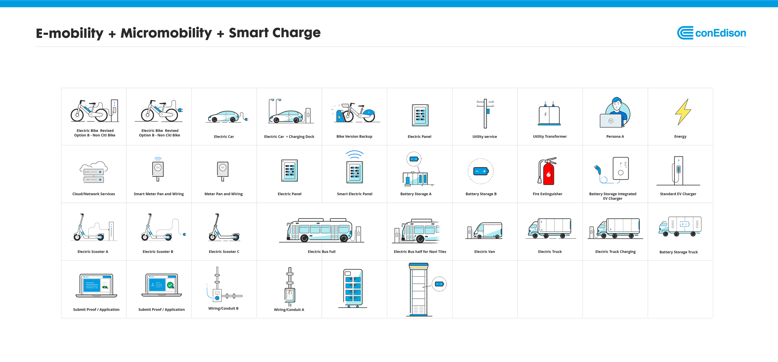
Custom Illustrations for PowerReady E-Mobility integrated into the existing brand system and illustration library.
Impact
The final design successfully addressed user pain points by improving discoverability, simplifying navigation, and streamlining the user journey. Key features like rebates and incentives became more visible, and the overall user experience was enhanced through visual clarity and intuitive interactions. These changes increased user engagement, reduced bounce rates, and created a more accessible platform.